Pinder

Meeting up with friends can be challenging due to busy schedules and large groups. Pinder is a mobile app designed to simplify planning and make meetups happen.

Project Context

Personal Project

Fall 2023

My role

User Research, User Testing, Wire framing, Prototyping, Analysis, UI Design, Design System

Tools

Figma

After Effects

Illustrator

The Initial Problem

Planning is a hassle

People often failed to meet up not because of disinterest, but due to the lengthy planning process. Missed communications and low participation are among the subtle issues that result in meet-ups never taking place.

People often failed to meet up not because of disinterest, but due to the lengthy planning process.

Missed communications and low participation are among the subtle issues that result in meet-ups never taking place.

The Challenge

Make planning efficient

The challenge was to reduce scheduling hassles and confusion happening while planning as those made the planning process longer.

The Process

Research

Research

Qualitative Interview

Qualitative Interview

Competitive Analysis

Competitive Analysis

Empathy Mapping

Empathy Mapping

Persona Creation

Persona Creation

Journey Mapping

Journey Mapping

Ideation

Ideation

Brain Storming

Brain Storming

Affinity Mapping

Affinity Mapping

User Flow

User Flow

Validation

Validation

Low Fidelity

Low Fidelity

User Testing

User Testing

Design

Design

Wireframing

Wireframing

Usability Testing

Usability Testing

Feedback Synthesis

Feedback Synthesis

Design Systems

Design Systems

Prototyping

Prototyping

Explorations

Explorations

Laying The Groundwork

What's stopping people?

I conducted qualitative interviews with four participants to identify what complicates or delays planning and what the painpoints were.

Insights from the interview

In the interviews, I found that most people rely on group chats combined with shared calendar apps as their main communication channels. Additionally, I revealed some shared insights. Below are the key insights I uncovered:

Constant scrolling to find information

Participants were frustrated by endless scrolling to find planning information.

Information and conversations not separated

With lots of information and no separation, going through each item becomes time-consuming.

Need for an organizer

Especially with larger groups, an organizer is needed to coordinate opinions. Without one, most remain unaware of progress, leading to cancellations or delays.

The Discovery

Current systems do not support planning actively

I performed a competitive analysis of apps such as iMessage, Google Calendar, Instagram Chat, and TimeTree to understand why they fail to meet user needs. I found that these apps do not provide adequate support for planning or information management, which forces users to handle all their planning manually. By identifying these gaps, I was able to discover the core issue.

I performed a competitive analysis of apps such as iMessage, Google Calendar, Instagram Chat, and TimeTree to understand why they fail to meet user needs.

I found that these apps do not provide adequate support for planning or information management, which forces users to handle all their planning manually. By identifying these gaps, I was able to discover the core issue.

  • Has to confirm possible dates

    Ask if everybody’s okay with the location

    Scroll chat checking if somebody replied

    Check everybody's availability

    Choose the location

    Decide on the time and location to meet

    Ask people to respond

    Interviewers constantly took these actions when planning in a group.

Has to confirm possible dates

Ask if everybody’s okay with the location

Scroll chat checking if somebody replied

Check everybody's availability

Choose the location

Decide on the time and location to meet

Ask people to respond

Check everybody's availability

Ask people to respond

Interviewers constantly took these actions when planning in a group.

Interviewers constantly took these actions when planning in a group.

Reframing The Problem

Lack of support slows scheduling

The lack of dedicated planning features and mixing everyday chat with planning details have made scheduling tedious, requiring extra time to find essential information and can be overwhelming.

This led me to ask: How can I create a more intuitive information structure and offer direct planning support? My solution was to design a chat app for organizing and coordinating plans.

?

How can I create a more intuitive information structure and offer direct planning support?

Mapping Solutions

Building a better planning experience in chat

After identifying the challenge, I divided it into two specific challenges that guided my focus throughout the design process:

How can I provide direct planning assistance?

How can I provide direct planning assistance?

How can I provide direct planning assistance?

How can I make information easy to access?

How can I make information easy to access?

How can I make information easy to access?

Identifying the pain points

At the start, I developed personas, empathy maps, and journey maps to pinpoint specific interactions that frustrated users, took extra time, or required support.

The key insights

Time adjustments are complex

Adjusting time is harder than setting a date. Users must manually find a time when everyone is available, and this process should be minimized.

Differentiate notification type

Some people disable group chat notifications due to excessive messages, making it essential to separate general and planning alerts.

Simplify response tracking

The need to individually check if everyone has responded and agreed should be minimized.

Ideation

Shaping Solutions

After identifying areas for improvement, I brainstormed with two colleagues and organized our ideas into an affinity map to pinpoint features that could address the issues.

Key features discovered

Poll systems

Poll systems on location, time, and text would speed up the decision process.

Real-Time update

Help users stay real-time updated without having to ask other people.

Shared schedule in-app

Facilitate shared schedules in-app for instant plan creation reducing time.

From Vision to Putting Users First

Crafting cohesive experience

Throughout the design phase, from low-fidelity to final high-fidelity iterations, the focus was on two main challenges:

Finding a sweet spot in the user flow

Crafting user-friendly UI

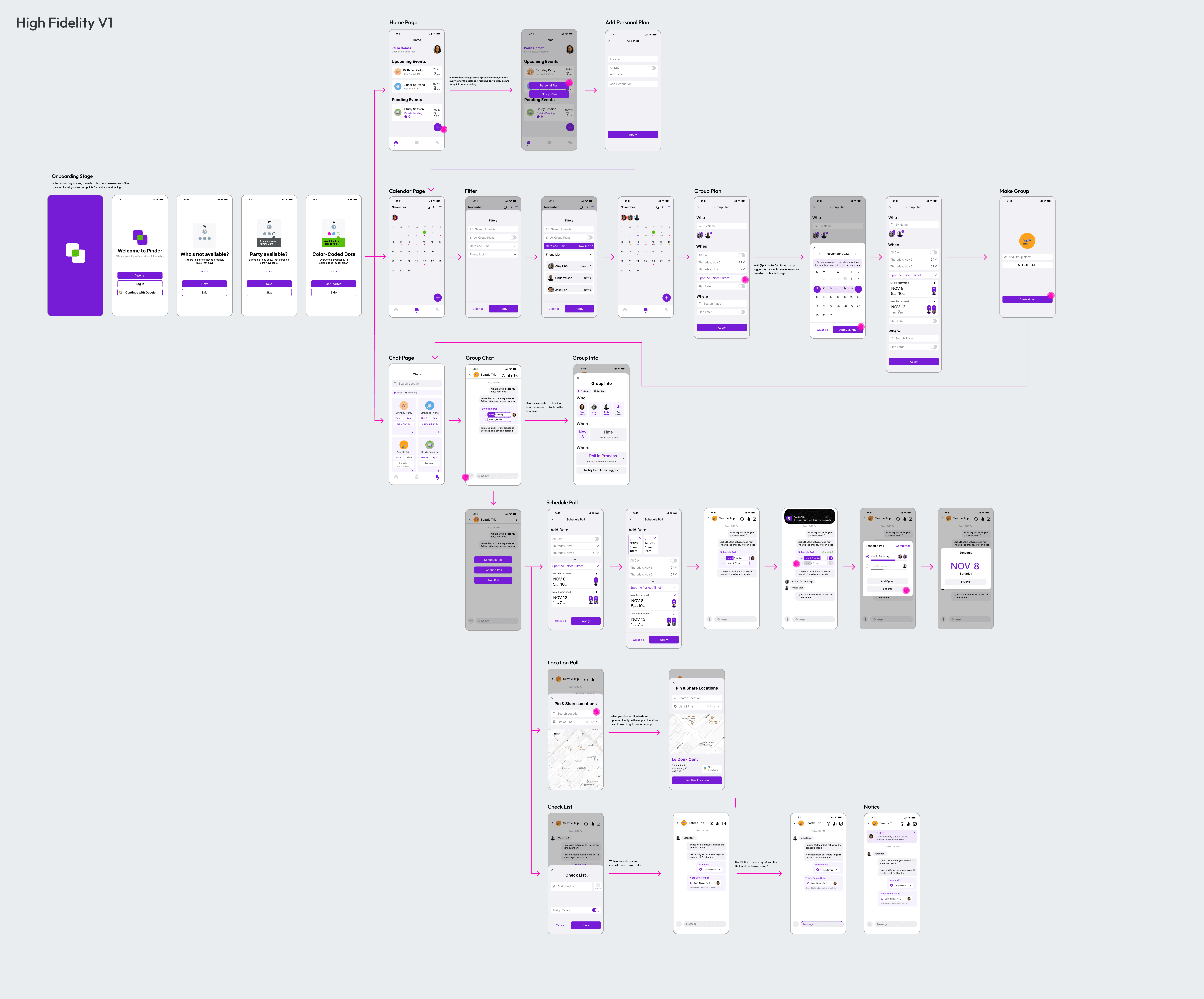
I began with a low-fidelity draft, refined it to mid-fidelity, moved to the first high-fidelity version, and finalized the design.

Design For Action

Balancing the user flow

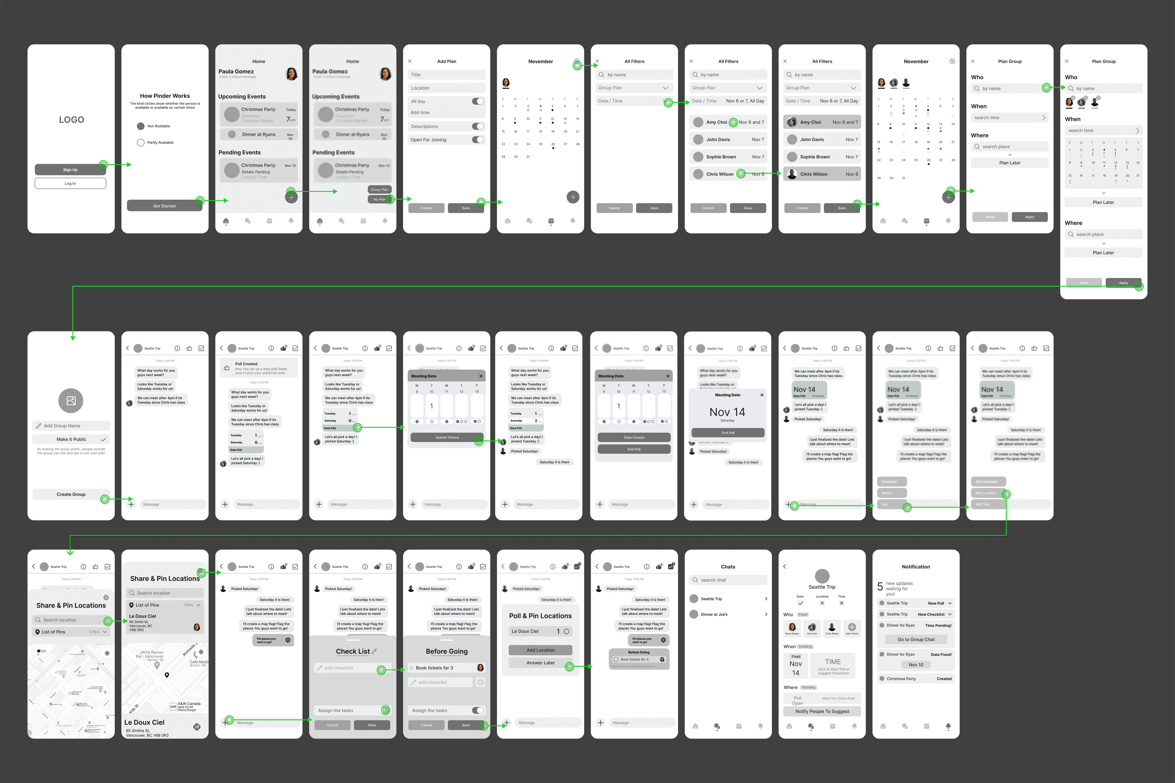
Initially, I concentrated on minimizing unnecessary flow to help users avoid navigating through multiple pages. This shift changed pages to sheets. Here are some of the wireframes that show the change.

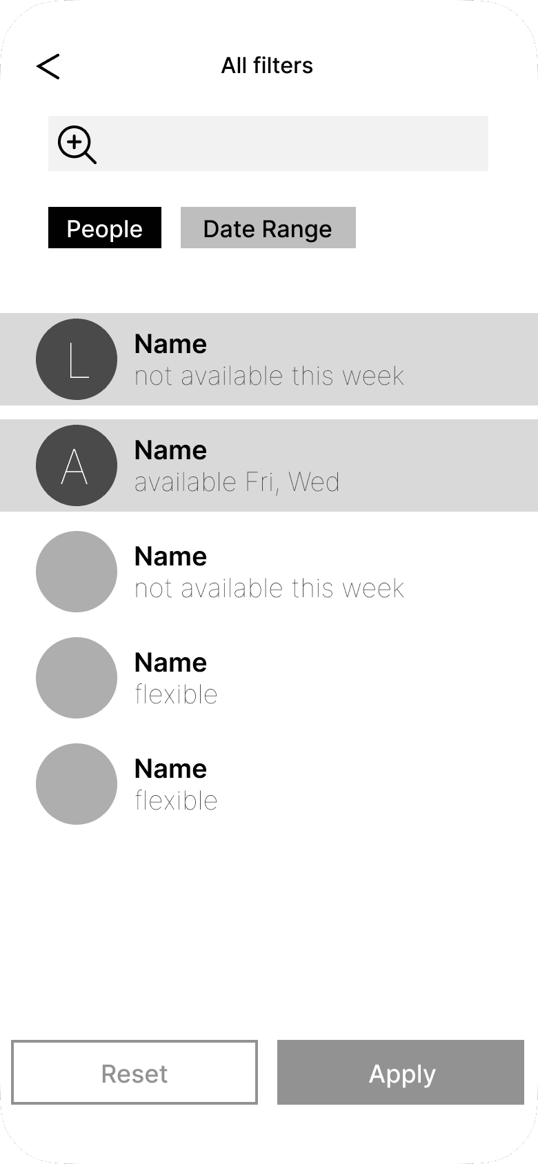
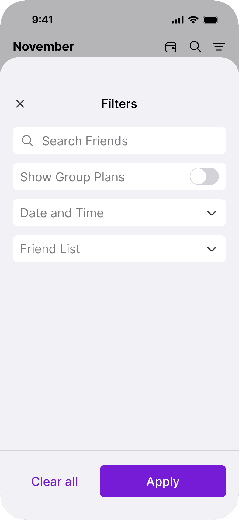
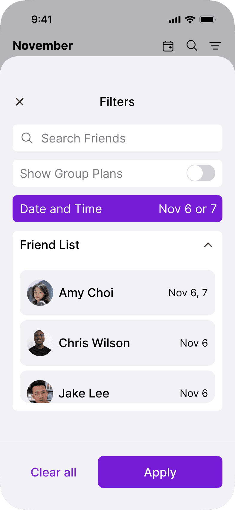
Filter function

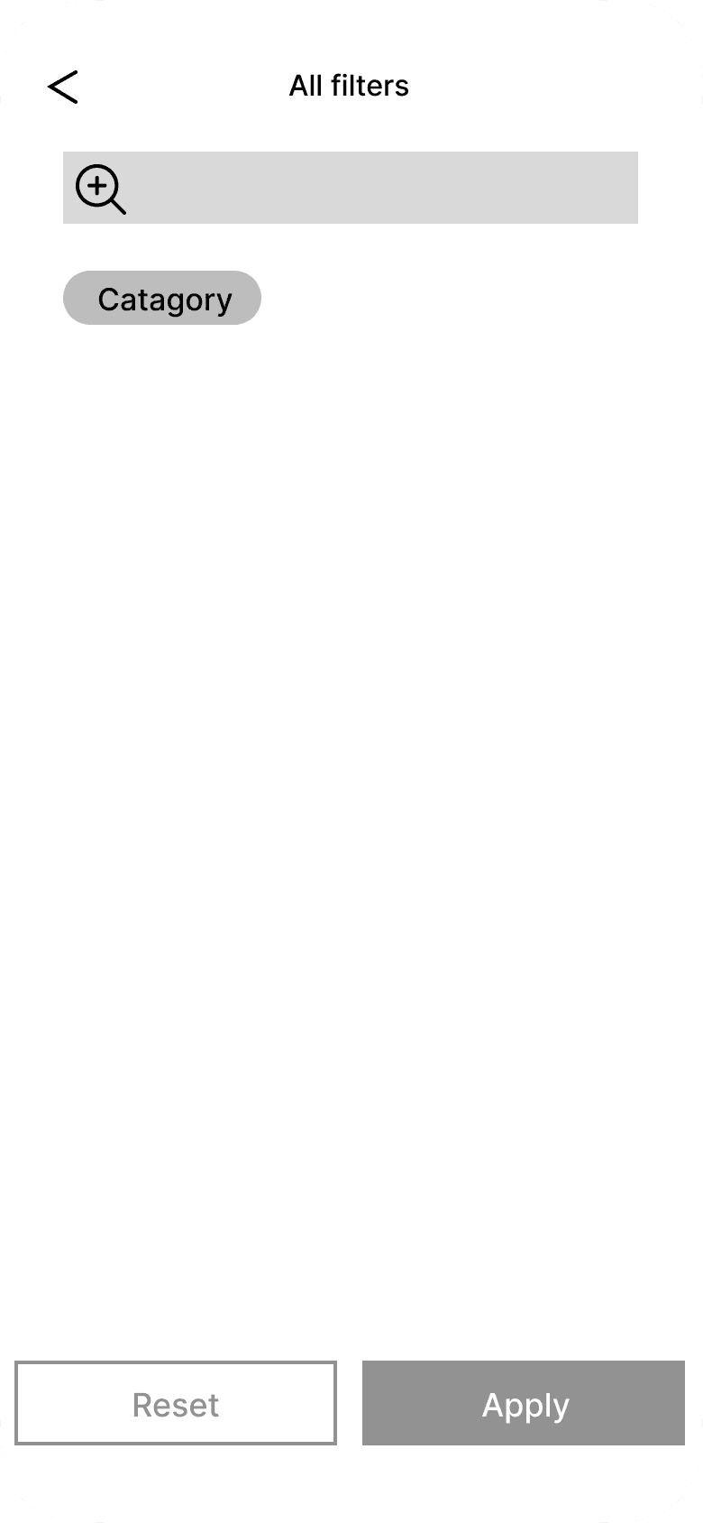
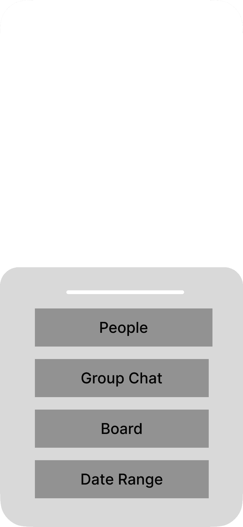
In the mid-fidelity stage, the filter opened as a separate page with three screen transitions. For the final design, I streamlined this interaction using a dropdown within a sheet, eliminating the need for multiple page transitions.

Mid Fidelity

Final Design

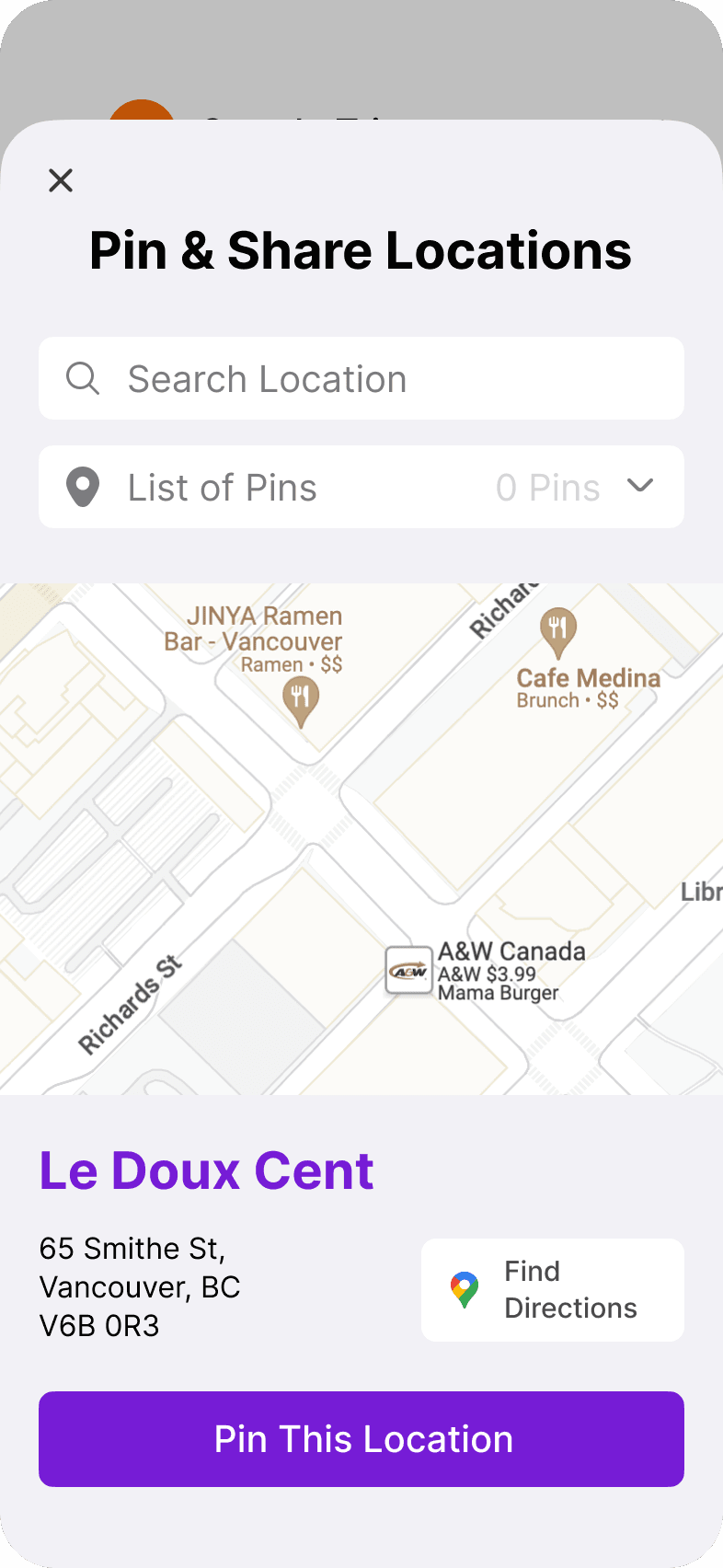
Location poll functions

While I aimed to reduce the number of steps, user testing revealed that presenting too much information on a single screen can disrupt user focus. For the location poll, I simplified the interface, displaying only key elements relevant to each interaction. This adjustment helps users navigate each step seamlessly without overwhelming them.

While I aimed to reduce the number of steps, user testing revealed that presenting too much information on a single screen can disrupt user focus.

For the location poll, I simplified the interface, displaying only key elements relevant to each interaction.

This adjustment helps users navigate each step seamlessly without overwhelming them.

High Fidelity

Final Design

Make It Effortless

Crafting user-friendly UI

The UI section was probably the part of this project where my ambitions went a bit too far, and it ended up facing the most challenges and changes. I’ve included wireframes that best show what happened and how things evolved.

The UI section was probably the part of this project where my ambitions went a bit too far, and it ended up facing the most challenges and changes.

I’ve included wireframes that best show what happened and how things evolved.

Changes in the calendar

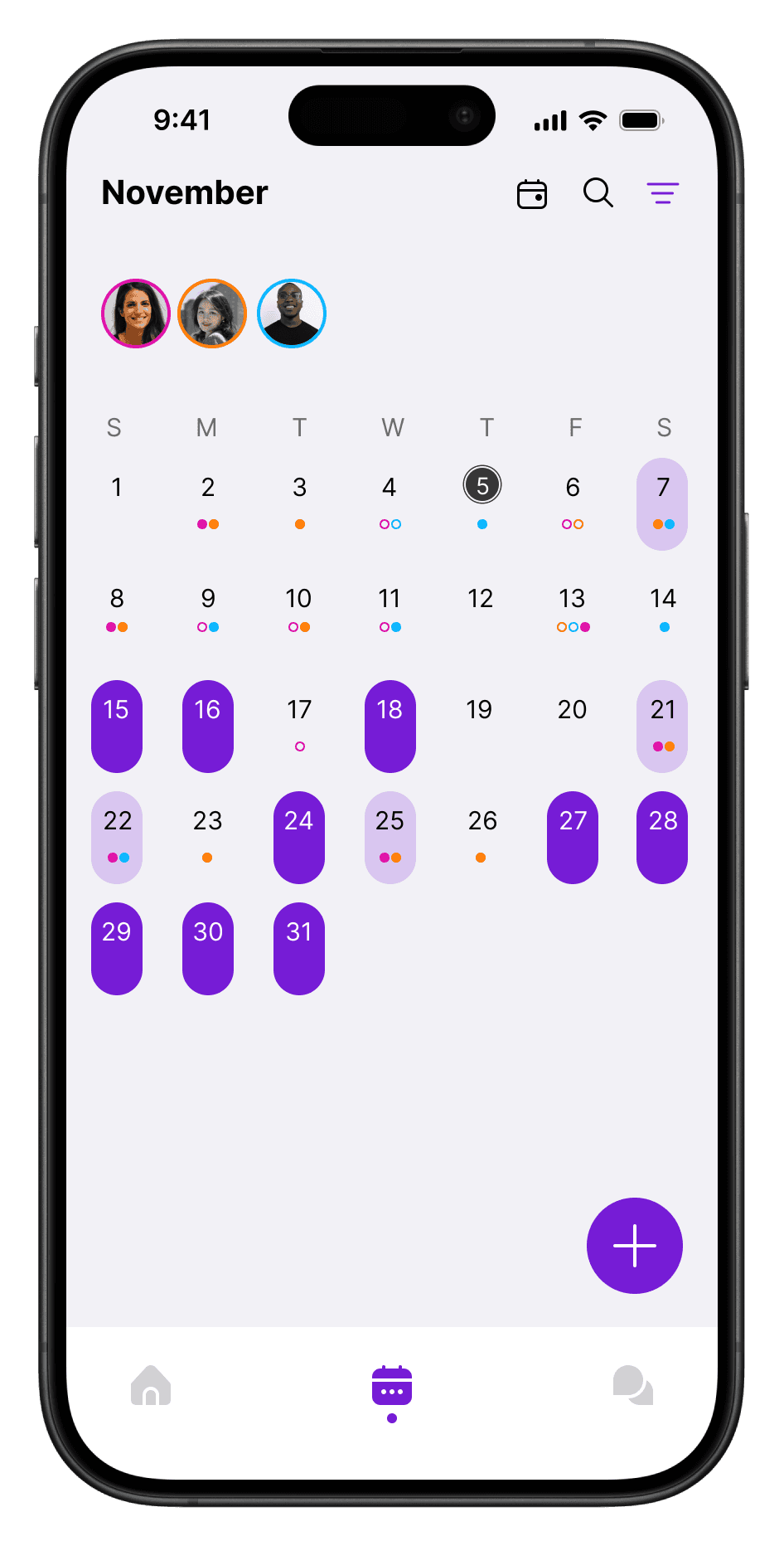
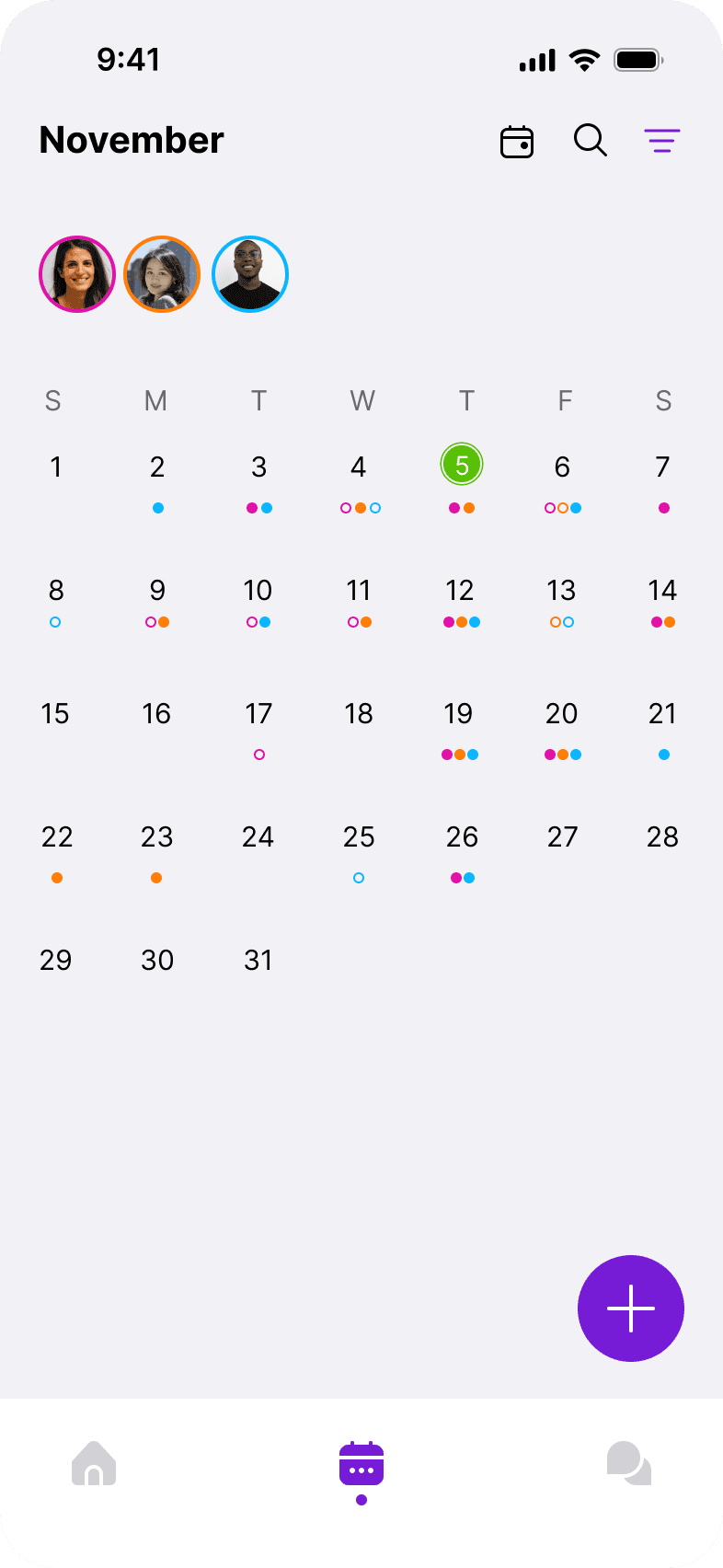
I initially planned to show people’s availability on the calendar using color-coded dots. Up to the mid-fidelity stage, I focused on marking busy days and conducted user testing. Feedback was mixed on whether to highlight busy or available days, so I explored this further with paper prototyping.

The results were split, but after careful consideration, I chose to mark busy days. The main reasons were concerns about color accessibility when displaying a large number of people and the need to avoid checking each person’s status individually.

The results were split, but after careful consideration, I chose to mark busy days.

The main reasons were concerns about color accessibility when displaying a large number of people and the need to avoid checking each person’s status individually.

Making it intuitive

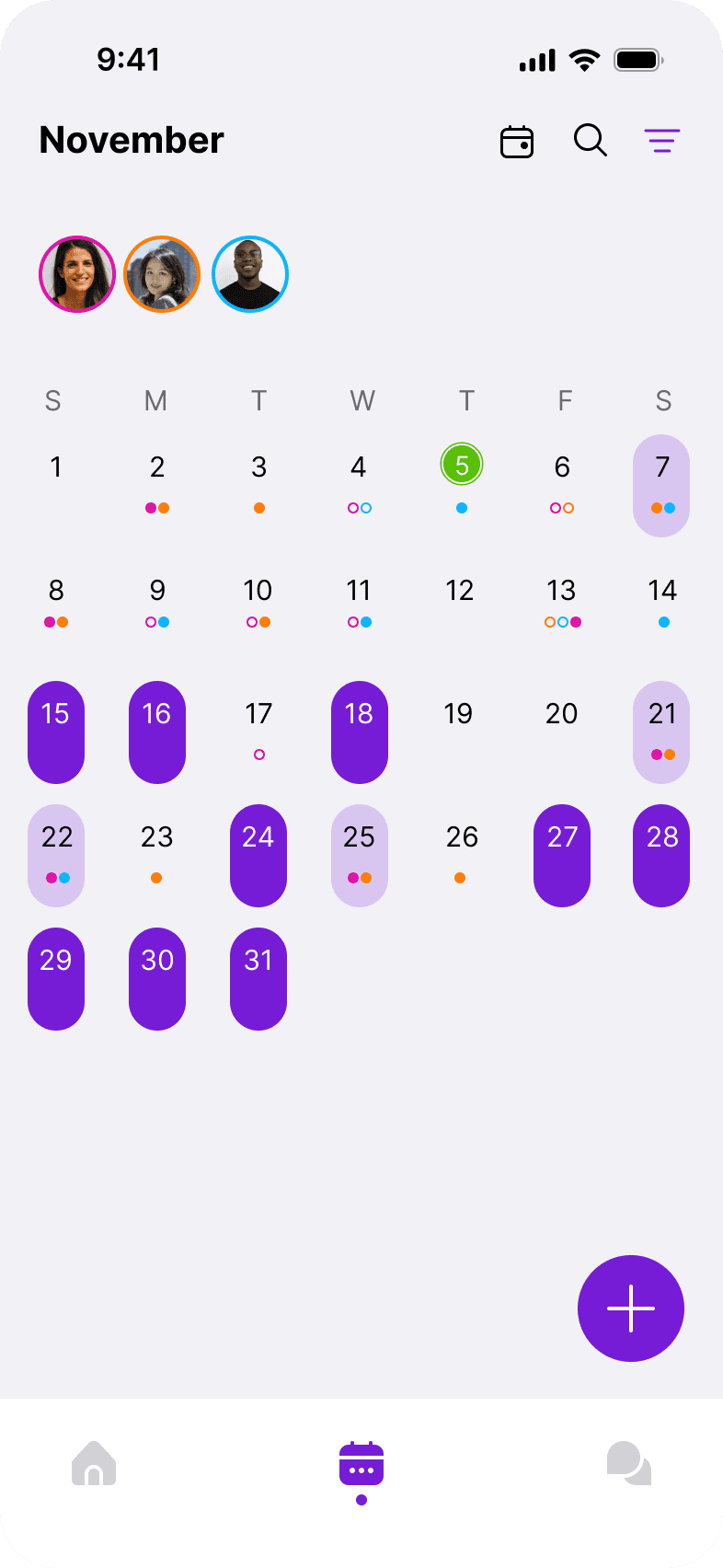
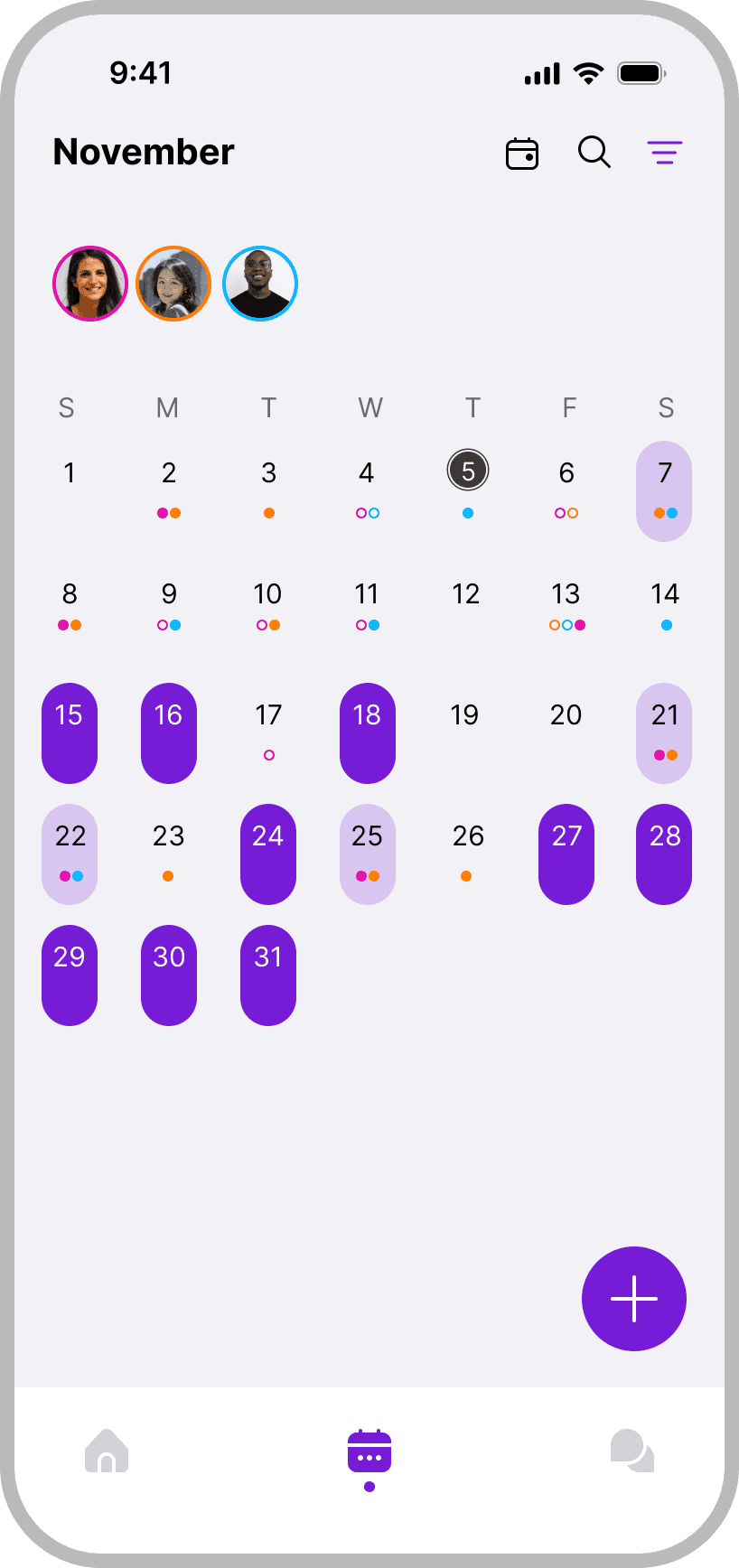
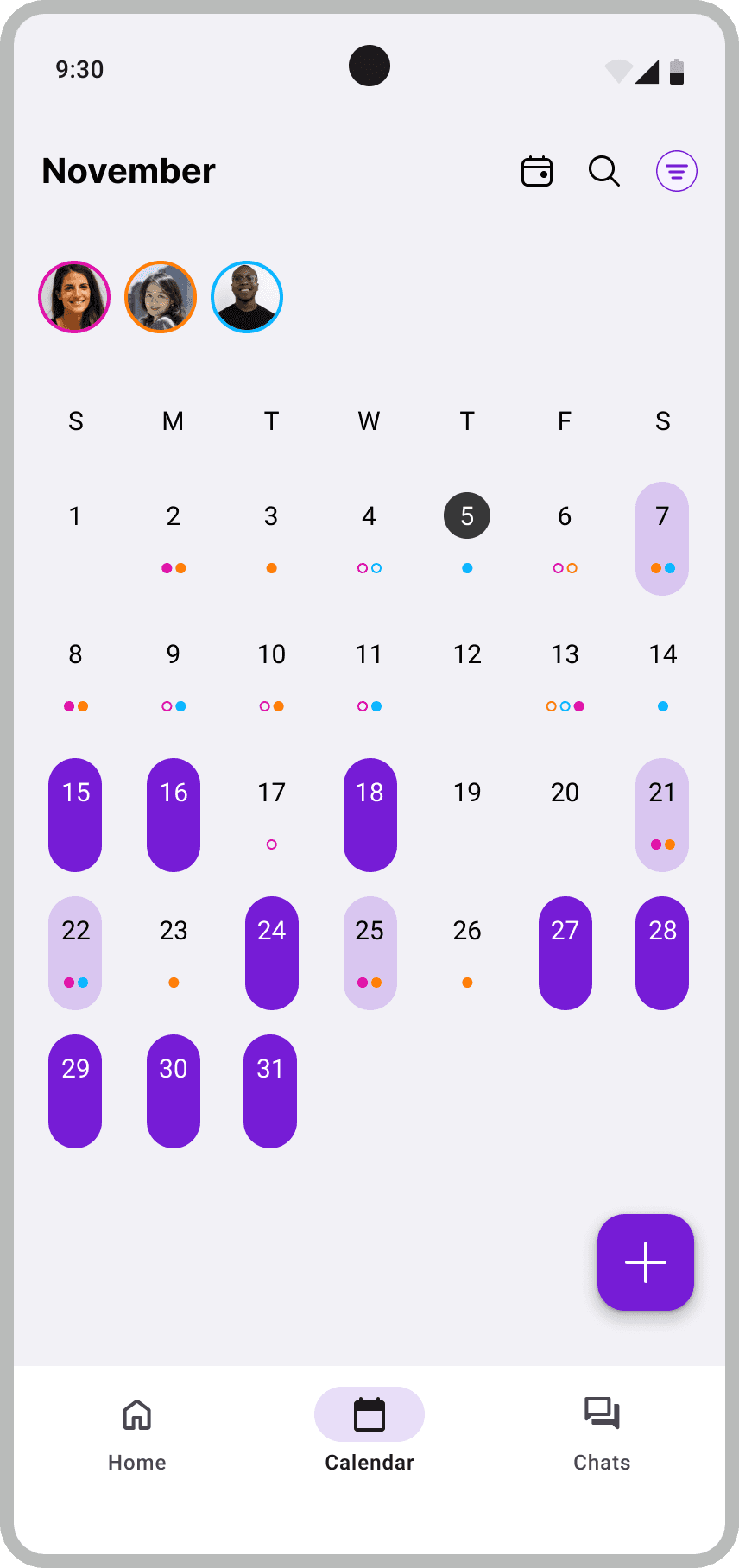
After deciding to mark busy days, I began high-fidelity user testing. Similar feedback kept coming up, so I had to rethink my approach. The main issue everyone pointed out was that my current method went against the app’s goal of quickly showing when everyone is available. For the final design, I chose a new method: a full box around dates when everyone is available and a half box when 50% of people are available.

After deciding to mark busy days, I began high-fidelity user testing. Similar feedback kept coming up, so I had to rethink my approach.

The main issue everyone pointed out was that my current method went against the app’s goal of quickly showing when everyone is available.

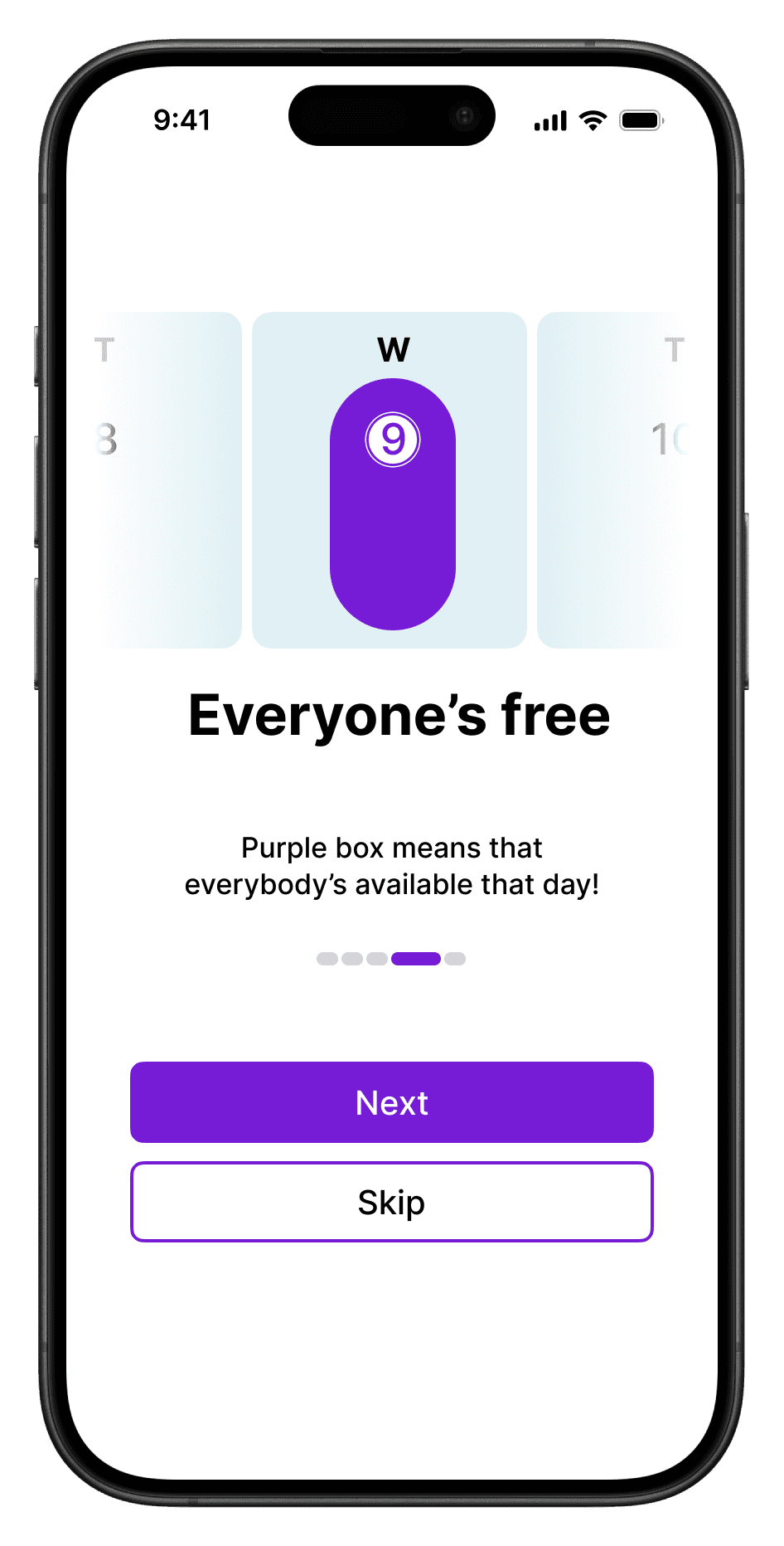
For the final design, I chose a new method: a full box around dates when everyone is available and a half box when 50% of people are available.

After deciding to mark busy days, I began high-fidelity user testing. Similar feedback kept coming up, so I had to rethink my approach. The main issue everyone pointed out was that my current method went against the app’s goal of quickly showing when everyone is available.

For the final design, I chose a new method: a full box around dates when everyone is available and a half box when 50% of people are available.

This way, 1) users can quickly spot days when everyone is available at a glance, and 2) they can also check days with partial availability, aligning with the app’s purpose and maintaining accessibility.

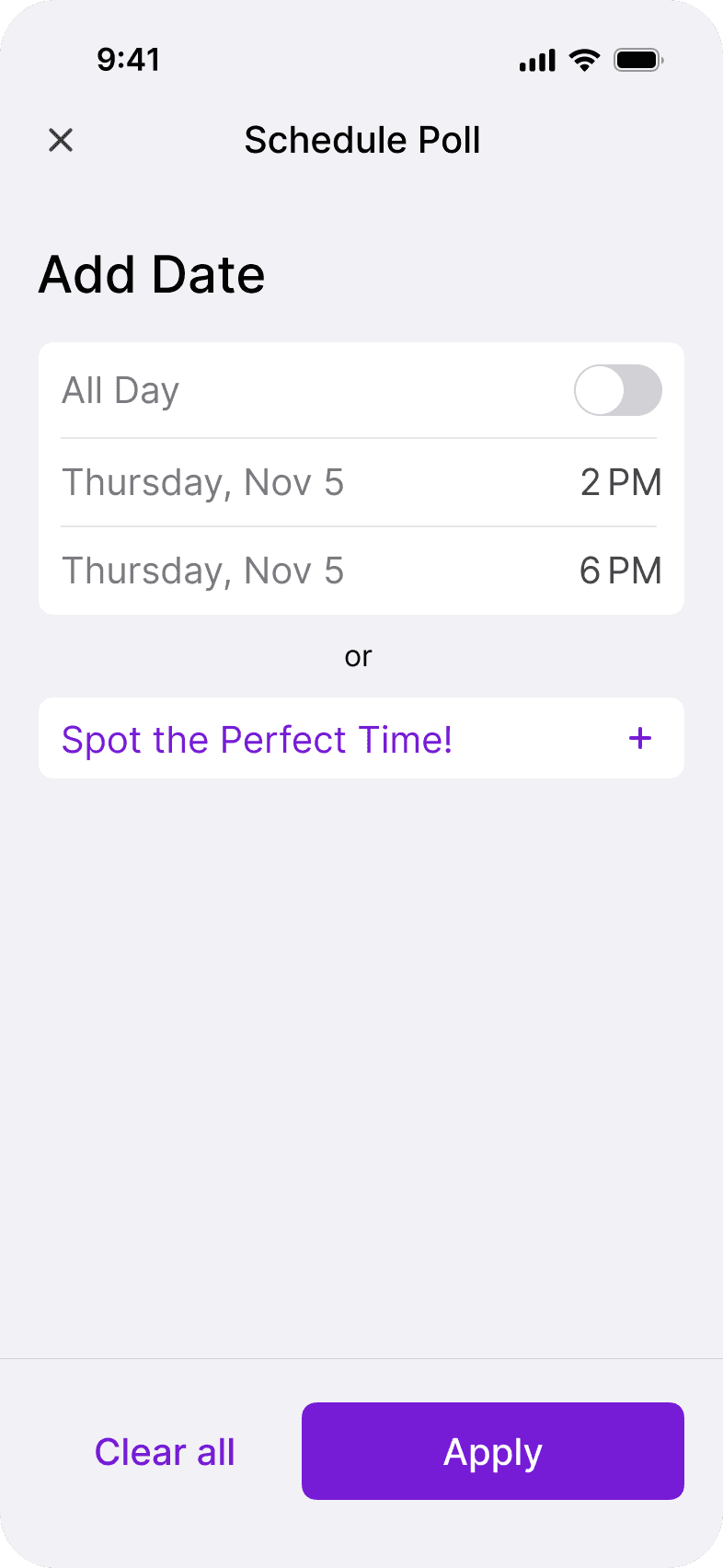
Simplifying Schedule Poll

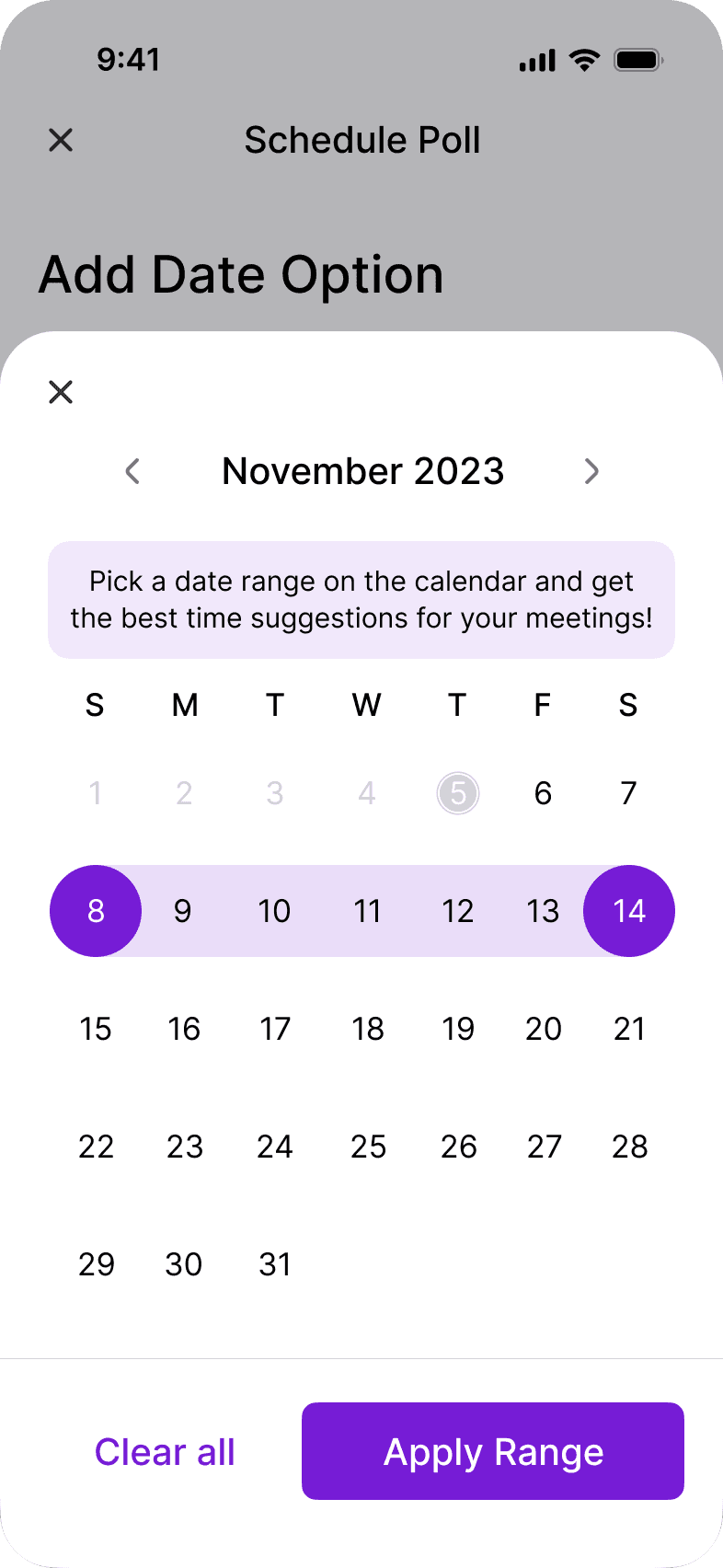
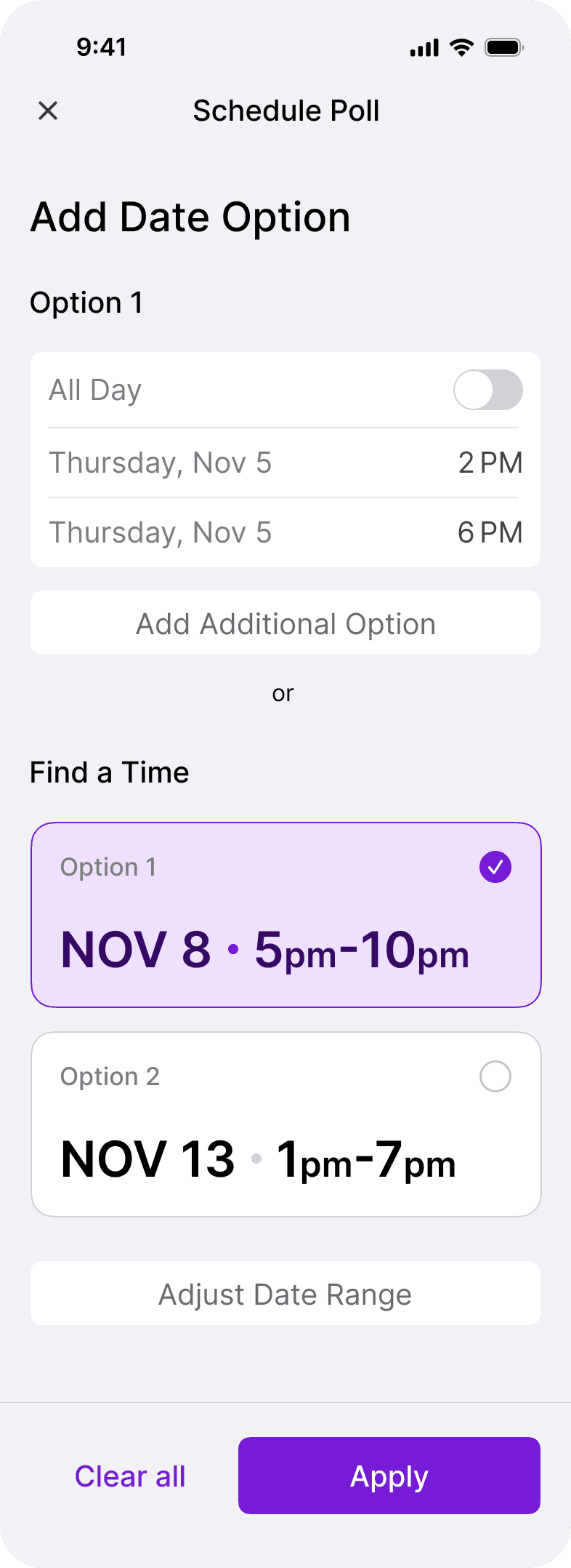
I realized the importance of clarity, especially with buttonsmaking sure users understand their function instantly. For the schedule poll, I focused on creating seamless interactions that feel natural and intuitive, designing a simple UI that enhances usability.

High Fidelity

Final Design

From iOS to Android

Cross-Platform design exploration

Keeping in mind that iOS and Android have different guidelines, I designed according to each system’s standards, focusing on a few screens to showcase the differences. Here are some examples:

Date pickers

I tailored details from date/time interfaces to switch shapes/layouts to highlight differences between iOS and Android, following their specific guidelines.

iOS

Android

Use of Sheets

For iOS, I used a sheet for schedule polls. For Android, due to guidelines where changes need keyboard input and aren't instantly saved, I selected a full-screen dialog.

iOS

Android

Navigation bars & FAB

I adjusted the appearance of navigation bars and Floating Action Buttons (FABs) to align with platform-specific guidelines. Android FABs feature distinct elevation, whereas iOS FABs maintain a flat design.

iOS

Android

The Final Design

Introducing to solution

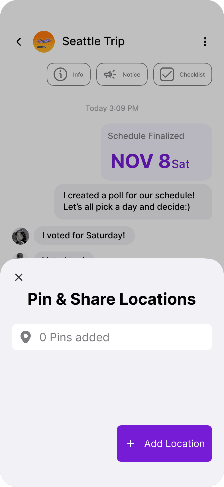
Pinder simplifies planning by allowing you to share schedules and chat without overlooking any steps in the process, ensuring a quick and straightforward approach.

Simple Differentiation Among Chat Bubbles

The issue was the bubbles for general and planning-related. Conversations looked the same. I redesigned the planning bubbles to be distinguishable.

Support Easy Decisions with Polls

For schedule polls, When users specify ranges, polls automatically recommends dates and times, streamlining the planning process.

Schedule Poll

Location Poll

Miscellaneous Poll

Support Easy Decisions with Polls

For schedule polls, When users specify ranges, polls automatically recommends dates and times, streamlining the planning process.

Schedule Poll

Location Poll

Miscellaneous Poll

Support Easy Decisions with Polls

For schedule polls, When users specify ranges, polls automatically recommends dates and times, streamlining the planning process.

Schedule Poll

Location Poll

Miscellaneous Poll

Find friends by date

By providing a filter function that allows users to sort people by their desired date, users can quickly start a group.
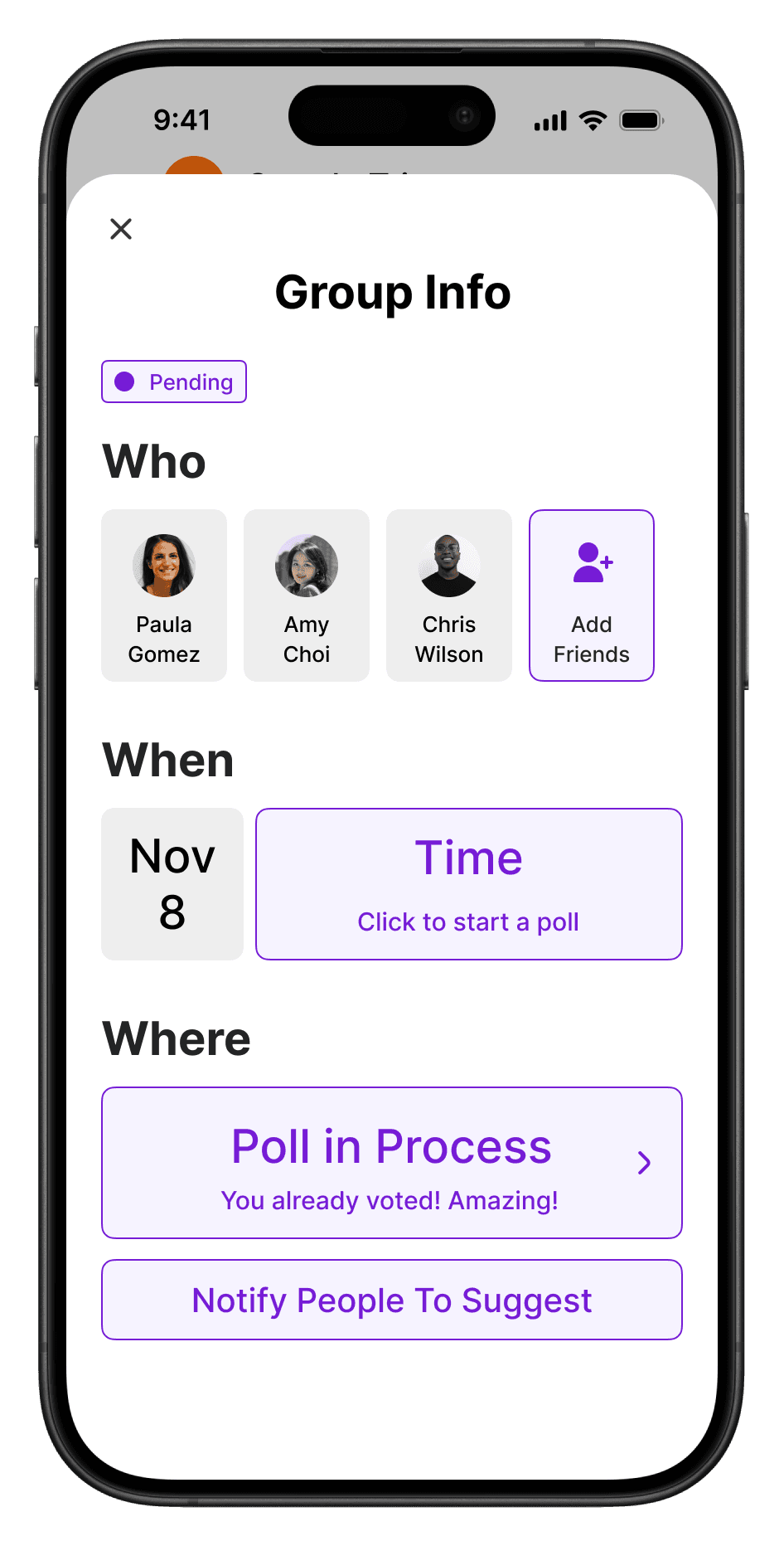
Easy Access to Information with Instant Updates
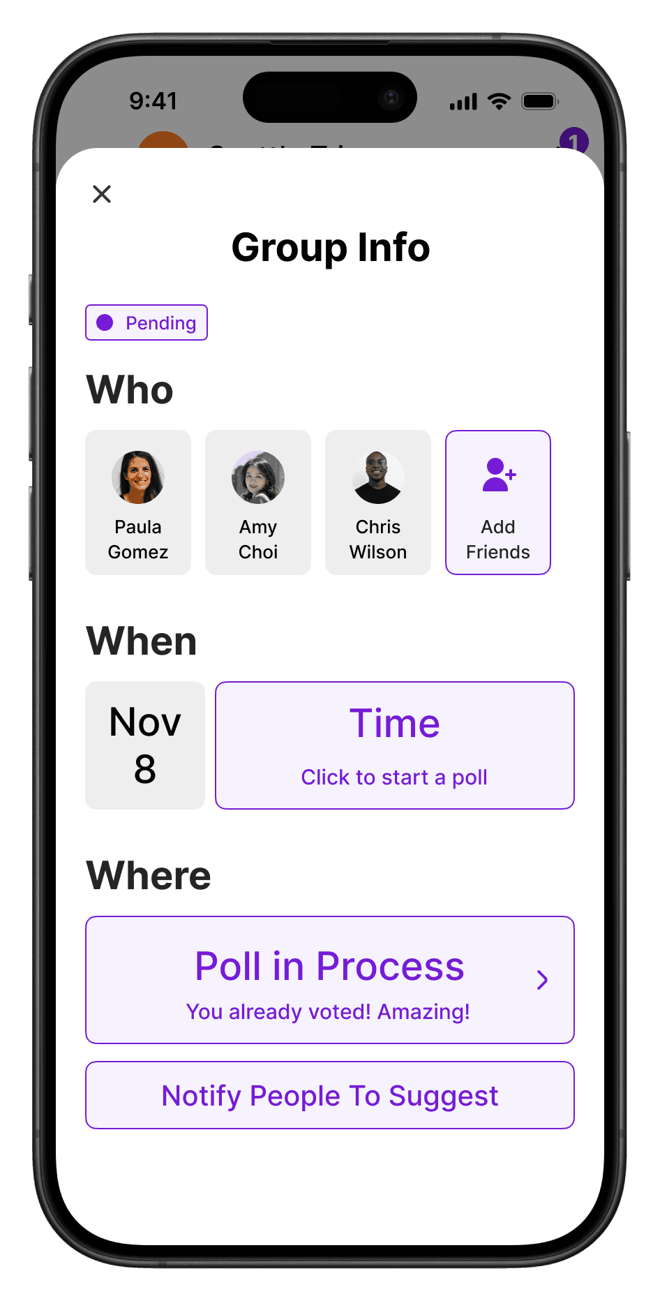
The information section keeps all group details updated, from participants to locations. Users can easily see what information is pending or confirmed.
The information section keeps all group details updated, from participants to locations.

Users can easily see what information is pending or confirmed.

Building More Features

Next Steps

If I had more time, I would like to build a community system for student groups.

For example, I’d create communities for each university where students can share clubs and activities with each other, making extracurricular activities more accessible and enhancing student communication.

Additionally, integrating the platform with school schedules would make it even more valuable, and a student verification system would ensure a trustworthy environment.

More works

Good Hot Tubs, Web Design

New E-Commerce Website Launch

Seoul Hive, Data Visualization

Explaining Koreas capital concentration