Seoul Hive
Seoul Hive is a data driven website, designed to clearly illustrate and raise awareness about the longstanding issue of population and resource concentration in South Korea's capital region.
Project Context
School Solo Project
Fall 2023
My role
User Research, Conceptualization, Wire framing, Prototyping, Data Analysis, UI Design
Tools
Figma
Illustrator
The Background
Most people and resources in South Korea are concentrated in the capital area
For a long time, political, economic, social, and cultural resources have been significantly concentrated in Seoul, and this issue remains unresolved.
Why is This a Problem
Rising Tensions Between Citizens
The conflict between Seoul residents and those from other regions stems from the concentration of resources and opportunities in the city. While many in Seoul are aware of the issue, they lack detailed information and show little interest in exploring it further, despite media coverage. Moreover, it is not a priority in national discussions.
The Challenge
Quick, Clear Information
I thought that if we could spark curiosity in people who wouldn’t usually seek out news and make it quick and easy to understand, it could raise awareness of this issue, even just a little.
The Process
Finding a Focal Point
What Should Be Shown for Effective Impact?
I researched data within the realms of population, culture, and economy to effectively illustrate this severity. Below are the data details I collected:
Inside Population
Urban Area Size & Population
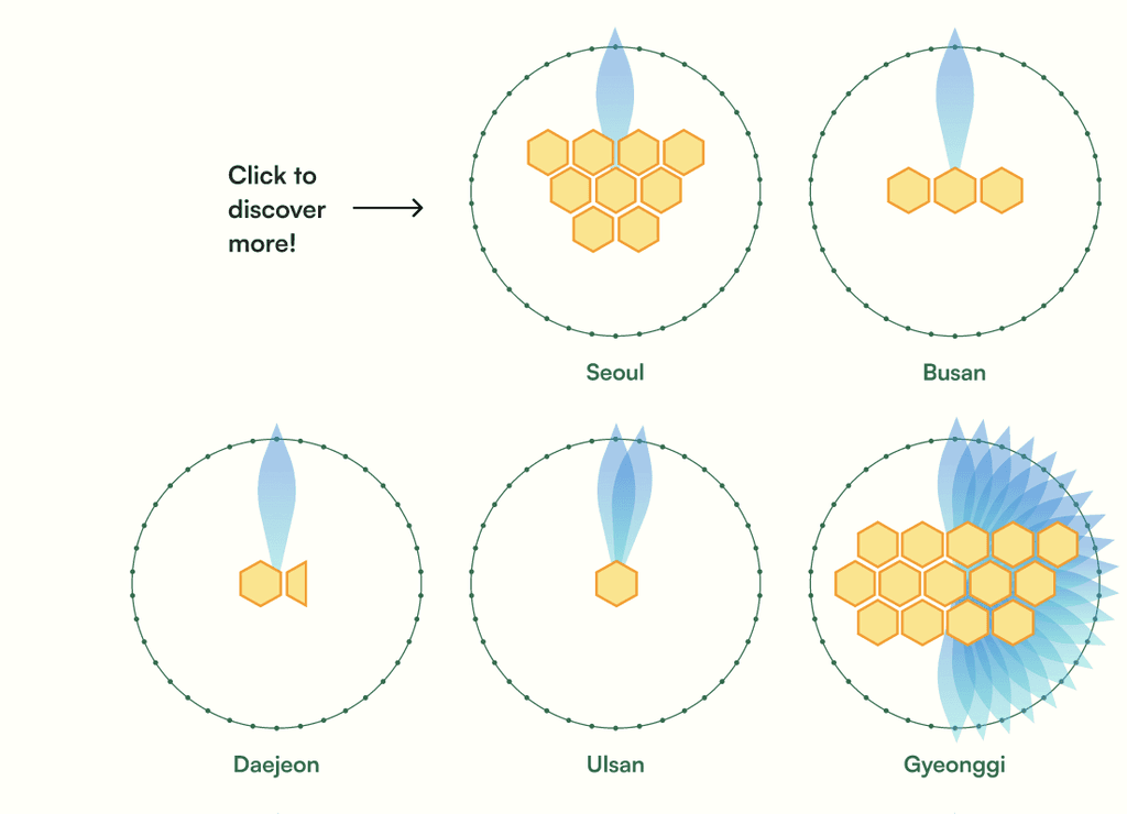
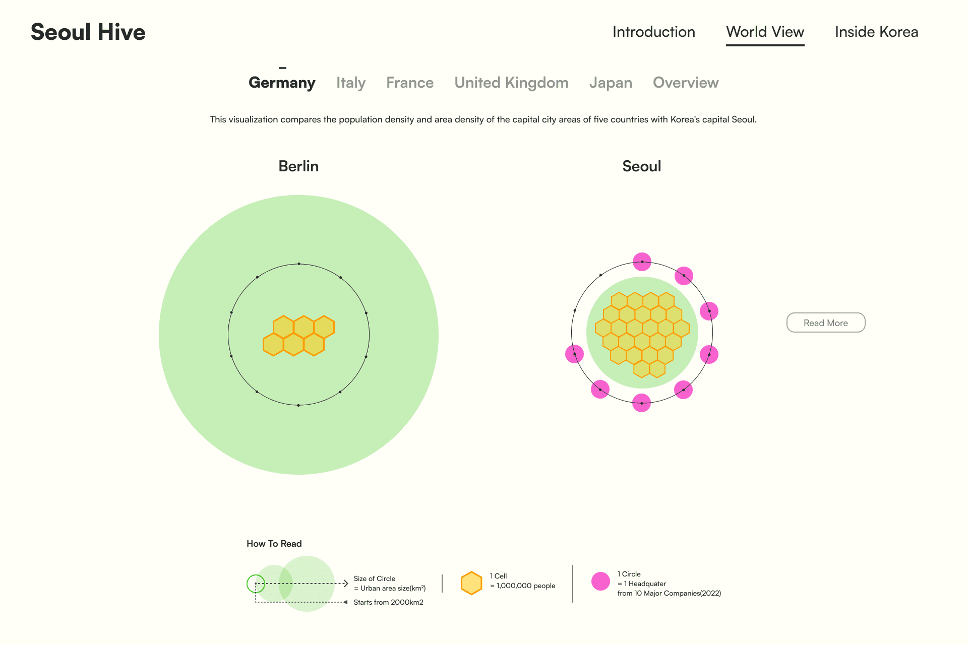
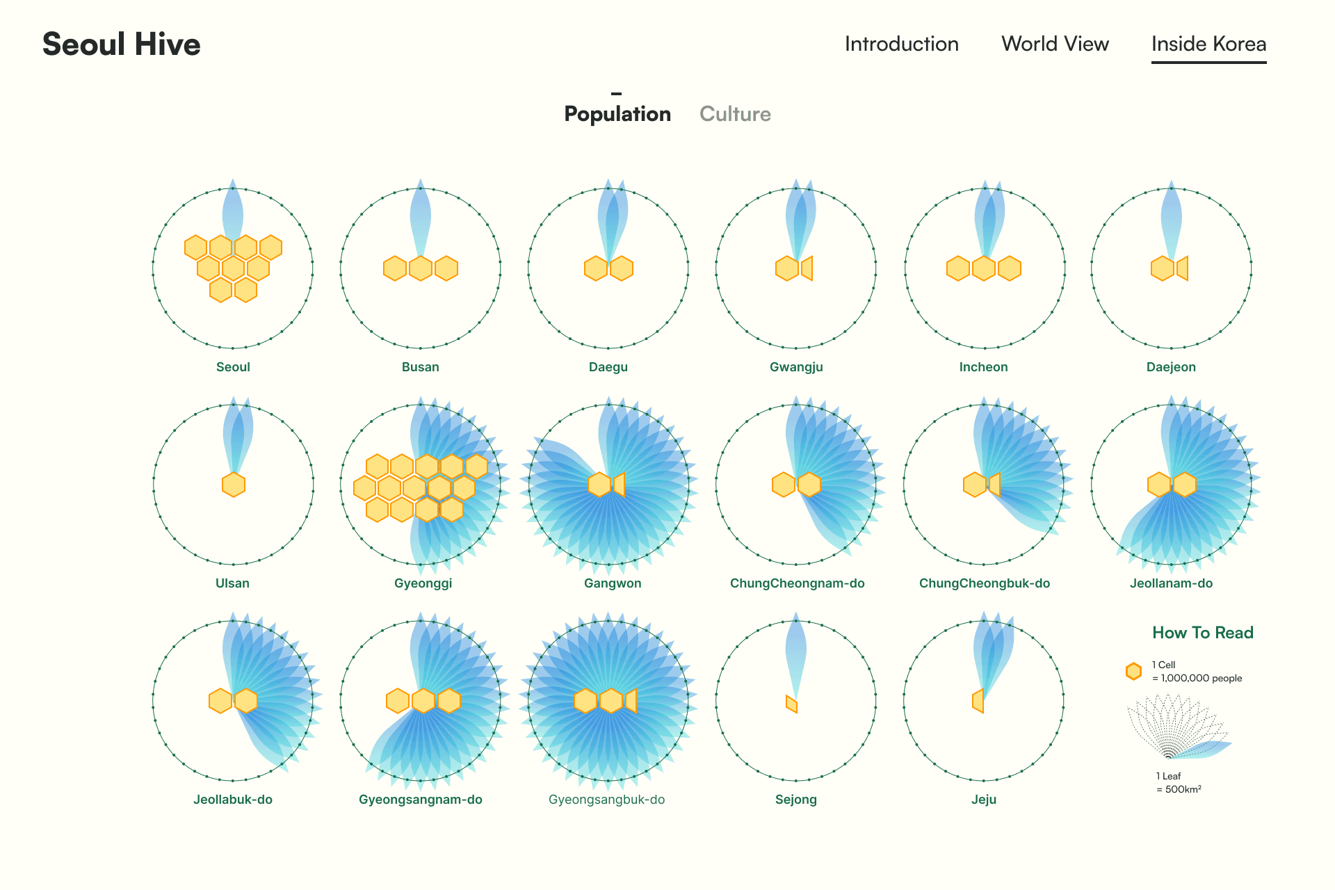
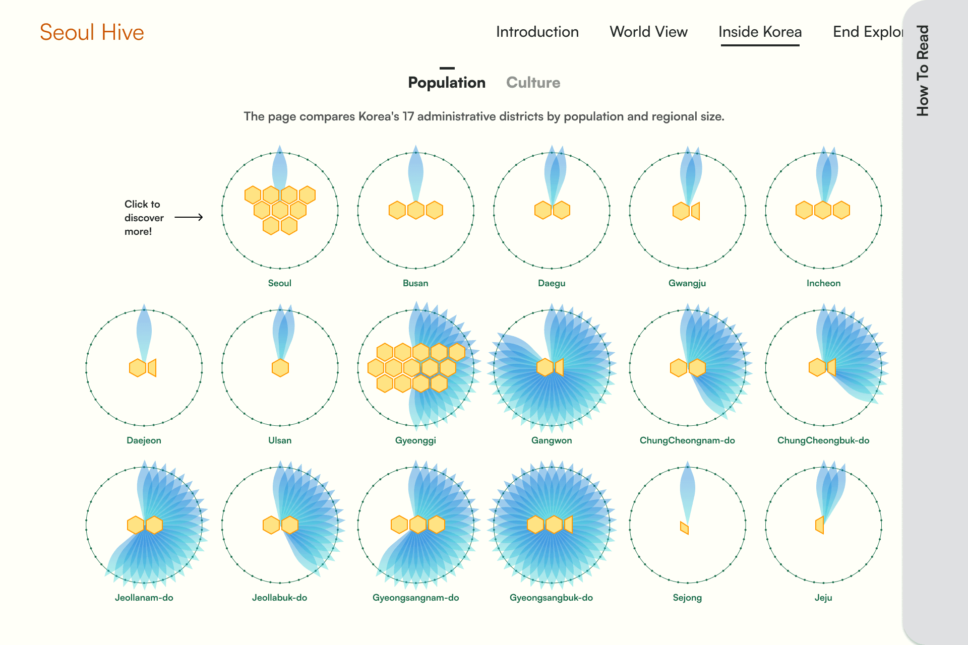
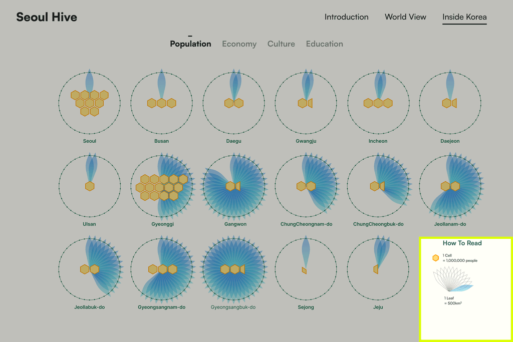
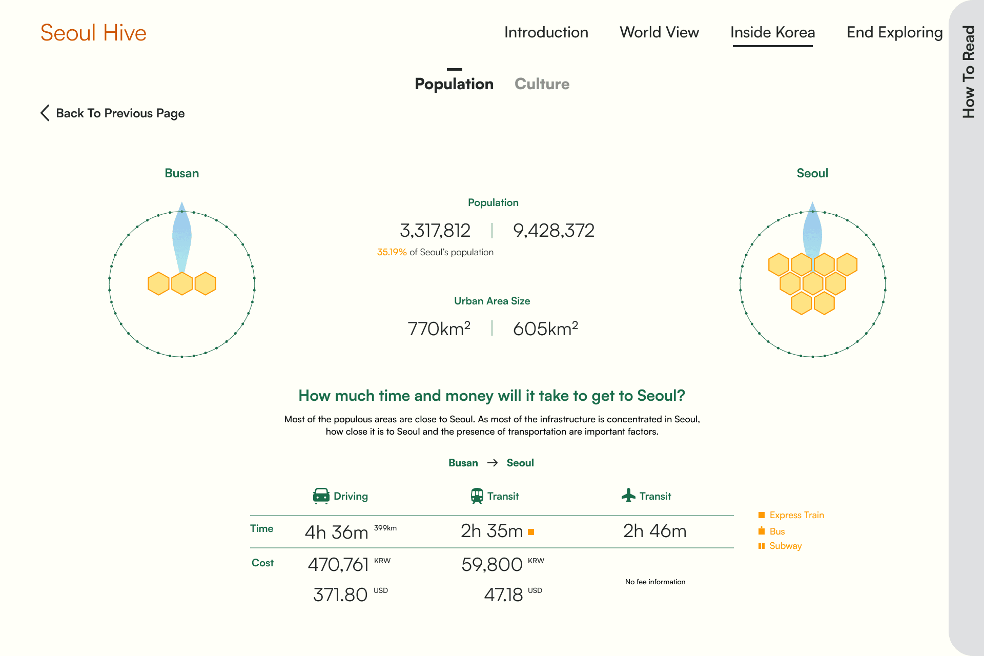
The situation's severity is clear because Seoul has a disproportionately large population for its size, while larger areas have fewer people.
Inside Culture
Exhibitions & Events
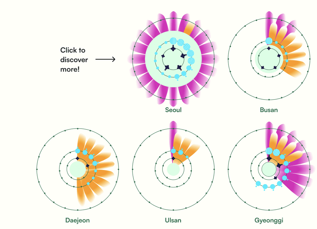
Culturally, most major exhibitions and events are held in Seoul, causing residents from other regions to frequently undergo complex processes like booking hotels.
Inside Economy
Head Quarters of 10 Major Companies
The headquarters of major corporations often align with population density. I analyzed the concentration of large corporations in Seoul and compared it to other countries.
Laying The Groundwork
Collecting Data
When collecting data, my primary focus was on the credibility of the information and its ability to illustrate the severity of the situation. Below is a list of the databases from which the data was collected:
KOSIS
The Korean Statistical Service serves as Korea's official database. It is reliable and organizes a wide range of information clearly, making data extraction easy.
Forbes
I obtained data on corporate rankings and headquarters information in selected countries from Forbes' "The Global 200."
Starbucks
Koreans truly love coffee, which relates to the concentration of amenities in the capital region. Half of the Starbucks Reserve locations, which offer a more exclusive service, are situated in Seoul, while many other regions lack these establishments entirely.
Analyzing Data
The collected data was quantified into metric scale units for visualization purposes.
Conceptualization
The Bee Hive Metaphor
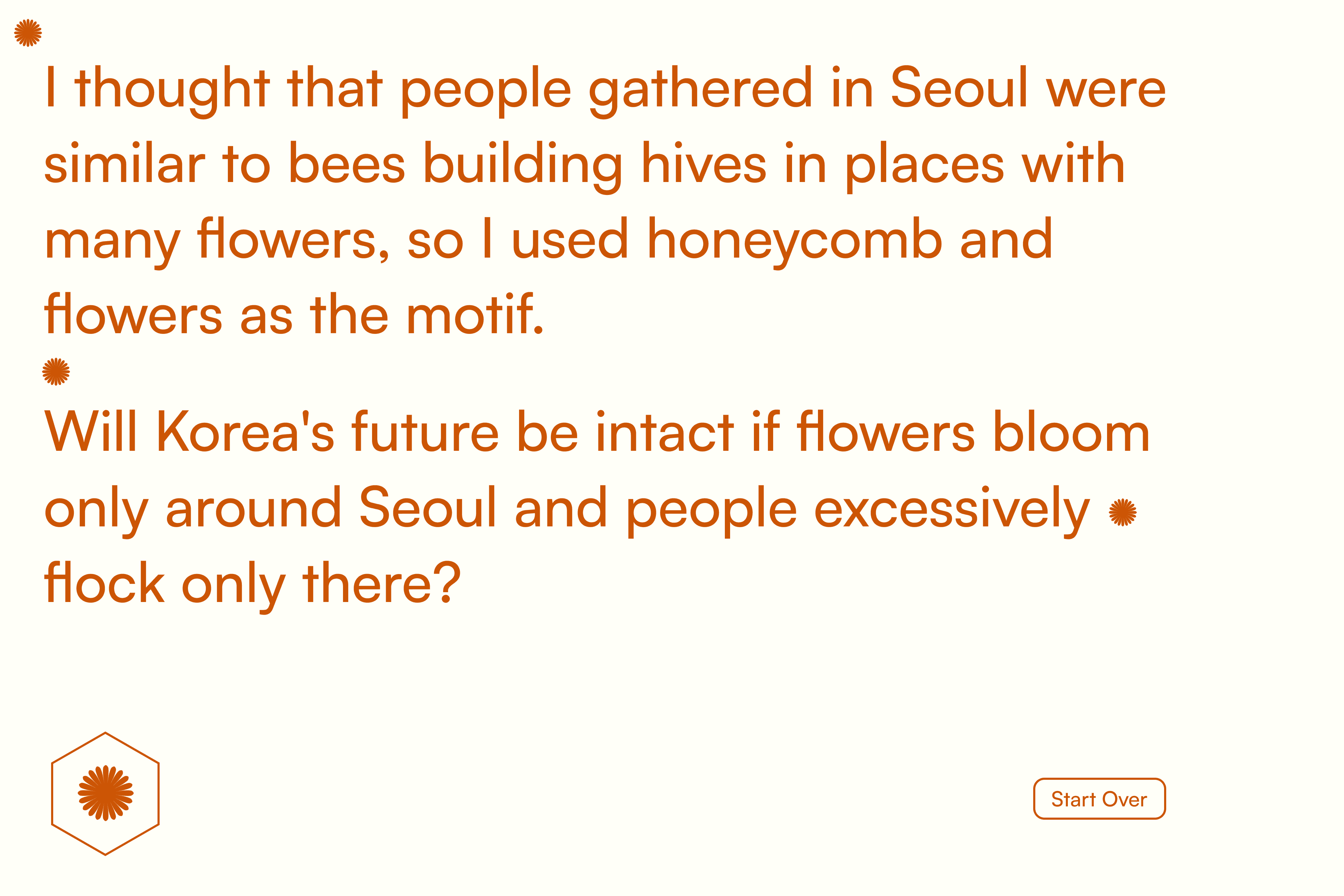
I thought the behavior of bees abandoning their hives to move to areas rich in flowers resembled human patterns, which led me to base the overall design on imagery of beehives and flowers.
Interviewers constantly took these actions when planning in a group.
Readability comes first
Enhancing the UI
During user testing, I made several visual adjustments to the design, with a strong focus on accessibility. Below are some key areas that underwent noteworthy changes.
Reducing eye strain
In my first iteration, I used a bright yellow inspired by bees and incorporated honeycomb cells into the design. However, usability testing revealed that the vivid colors caused eye strain.
To address this, I switched to a beige background and adopted a more calming design.
First Iteration of the "World View"
Second Iteration of the "World View"
Make color for everybody
Among the feedback synthesized, a crucial point was the need to enhance accessibility in color selection. This prompted me to reconfigure the color scheme. I used the "Coloring for Colorblindness" tool by David Nicholas to adjust the palette for clarity across all viewers. Crafting a color palette that accommodates the different types of color blindness proved to be a significant challenge.
The Side Challenge
Limitation of color
The available color combinations were limited given the amount of information I needed to convey and the fact that colors should ensure clarity and visually enrich the overall design was a tough challenge.
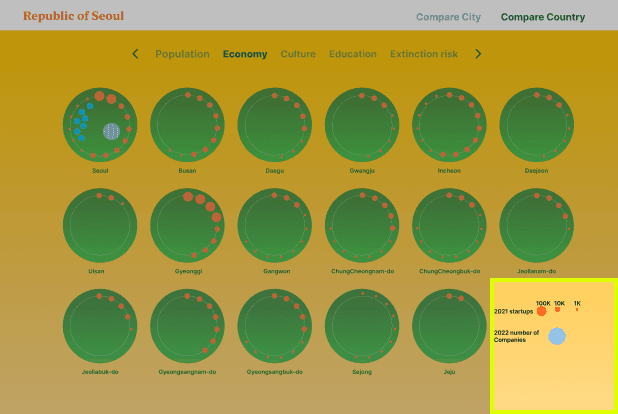
The data's I used for the project
The Side Solution
Developing better design structure
By developing a better color structure, I made the data easier to see for everyone and added more information without creating clutter.
Reduced the color palette to one color per data point
Utilized a blend of patterns and varied shapes to enhance clarity
Adding Different Design
I created a page that compares the capital regions of South Korea with those of other countries. It looks at population and the locations of the top 10 corporate headquarters based on 2023 rankings. I also included different visualizations to show comparisons within South Korea.
World View
Population Inside South Korea
Culture Aspect Inside South Korea
Introducing the Solution
Seoul Hive
Seoul Hive visualized the severity of capital region concentration, from population to cultural aspects, also comparing it with different countries.
Adding More Data
Next steps
This experience was fascinating, as I've long been interested in data visualization. It was challenging yet rewarding to present diverse information clearly. Unfortunately, I couldn't create a more engaging interactive website or include all my initial ideas, but I plan to refine and expand this project in the future. Below are the ideas that I wish to add in my next steps:
Add Education Information
Transportation Problems
More works
Good Hot Tubs, Web Design
New E-Commerce Website Launch
Seoul Hive, Data Visualization
Explaining Koreas capital concentration
